Graphic and creative design of extra virgin olive oil labels for ORO DE OSTUR
Portfolio of graphic and creative design work for extra virgin olive oil labels for the brand ORO DE OSTUR
At OFIFACIL, we are passionate about turning the essence of exceptional products into an image that speaks for itself. Introducing "ORO DE OSTUR," a design symphony that embodies the quality of one of the finest extra virgin olive oils from Spain.
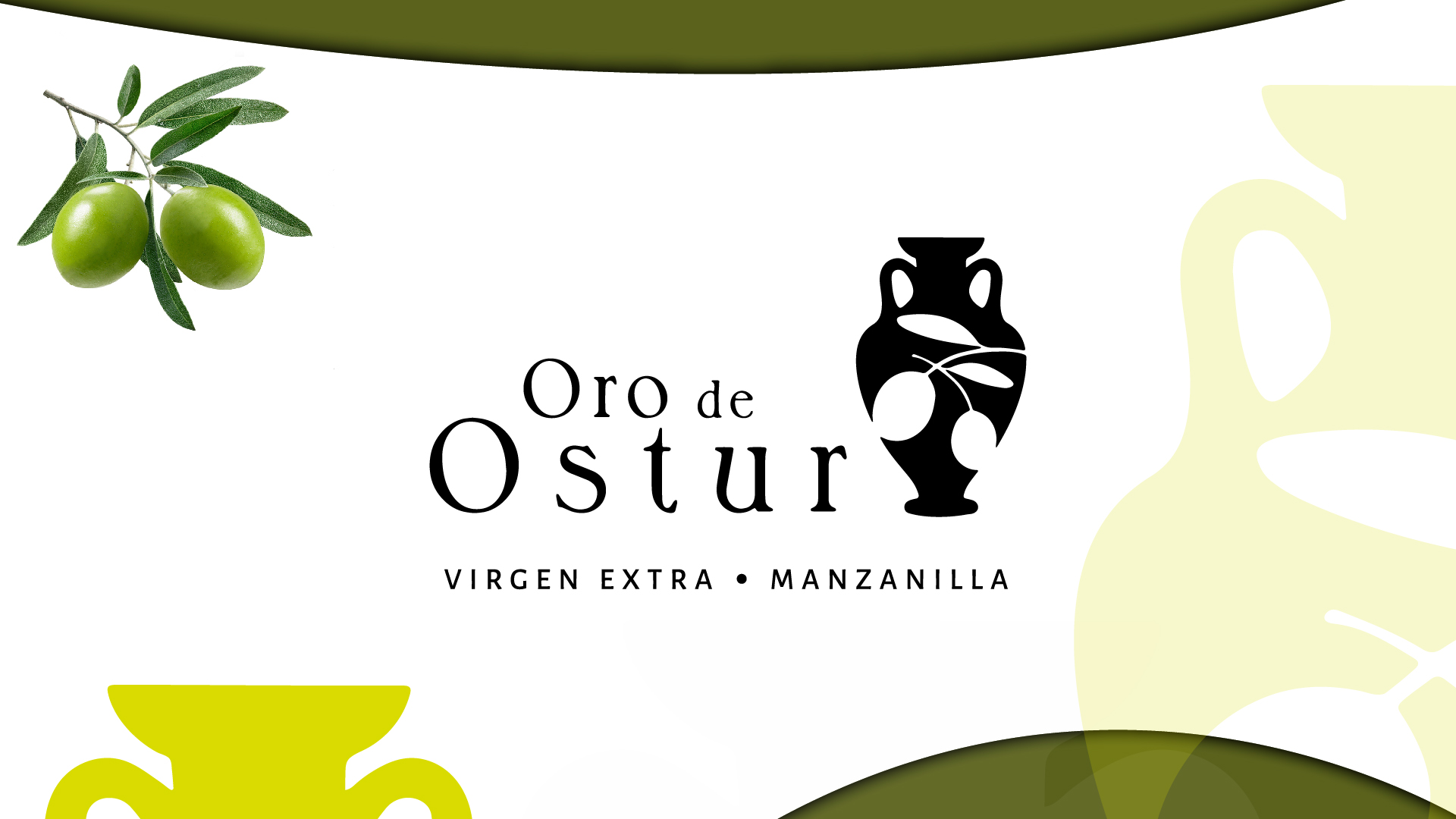
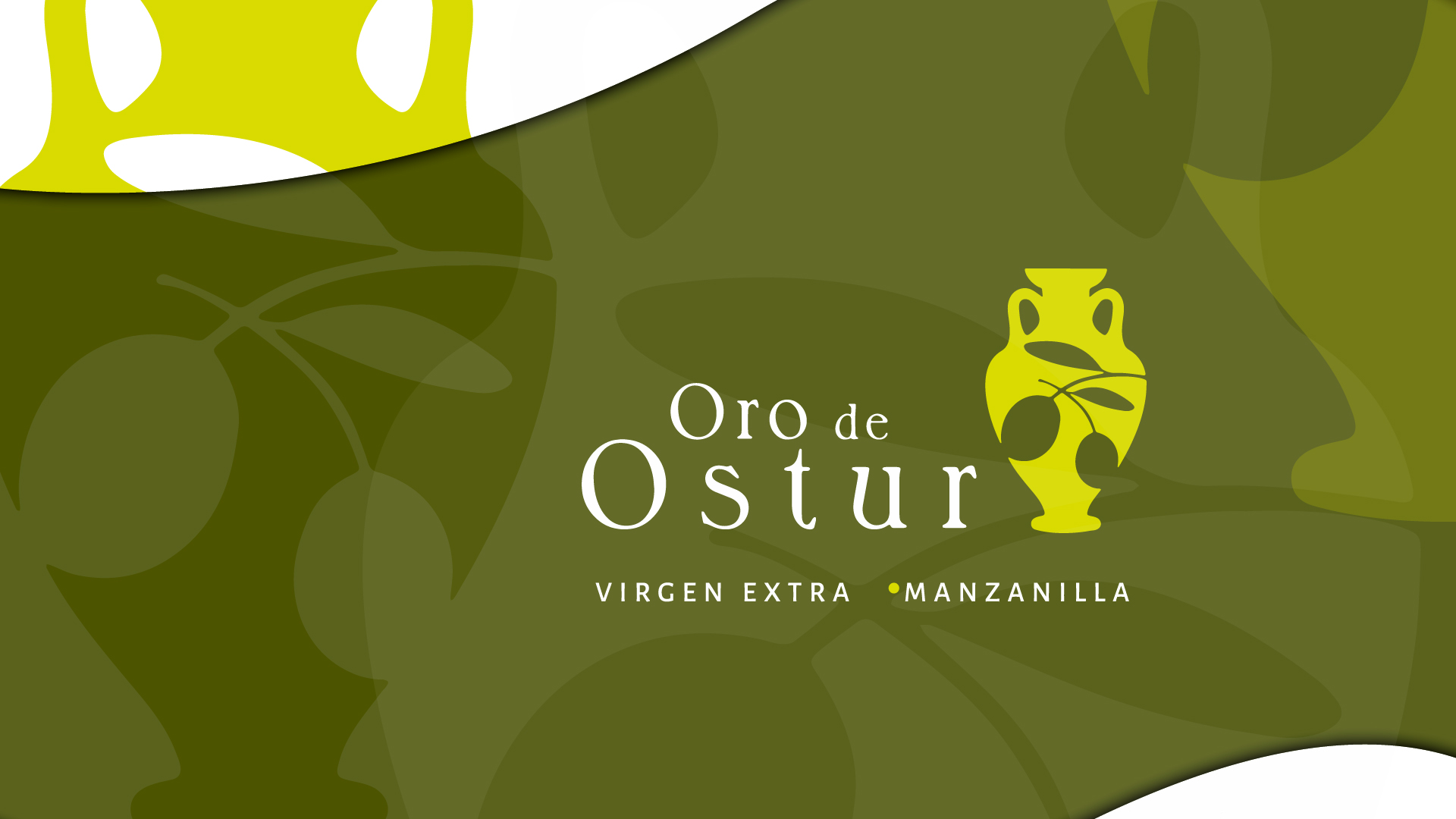
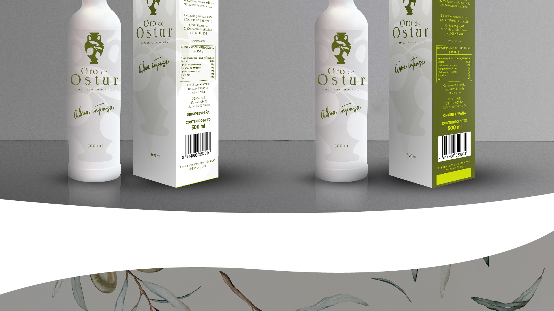
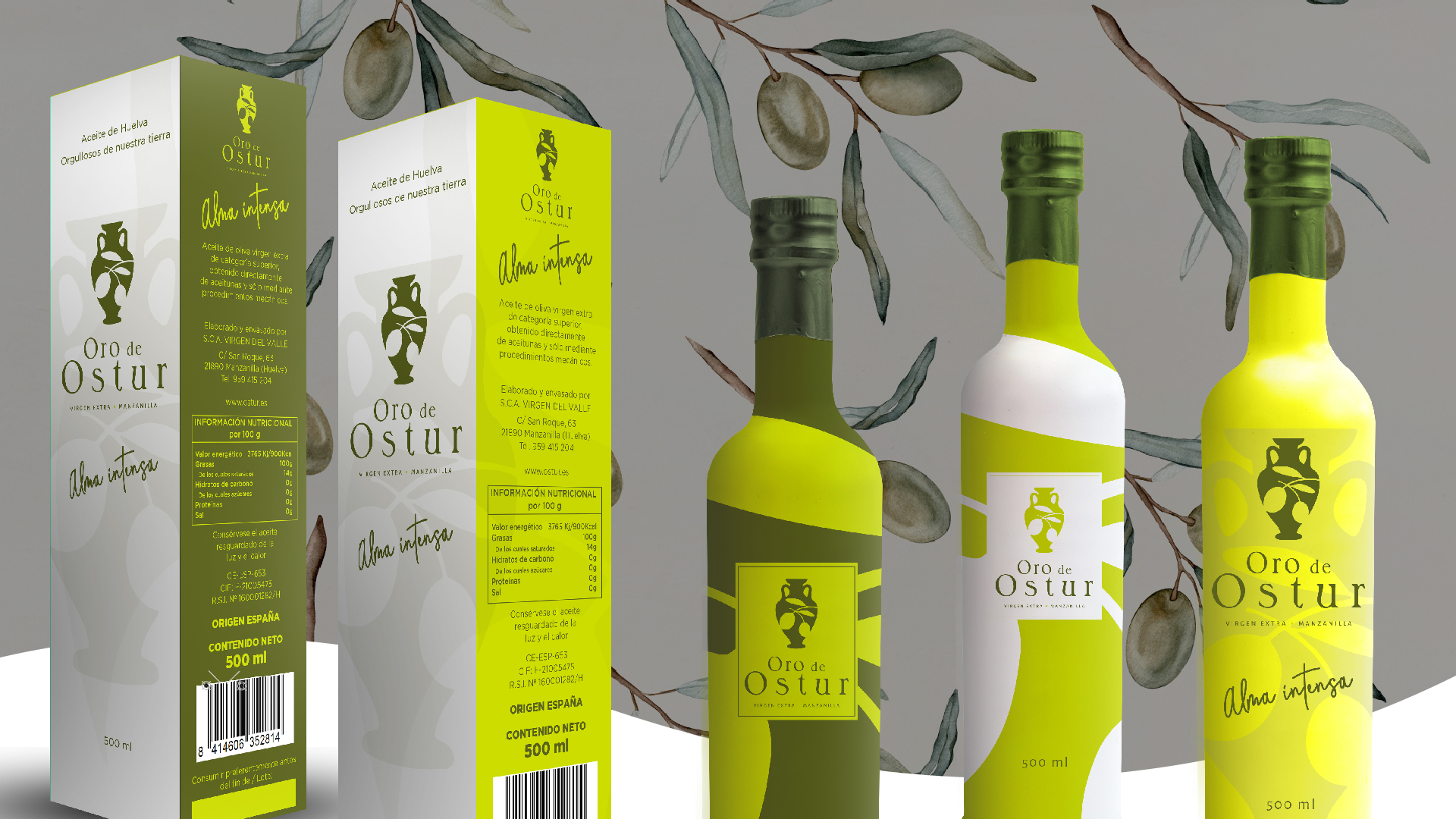
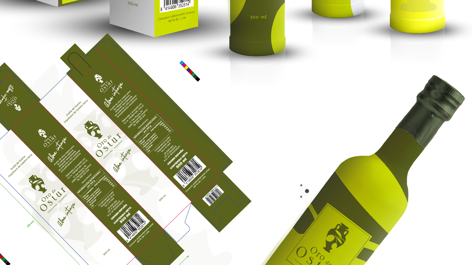
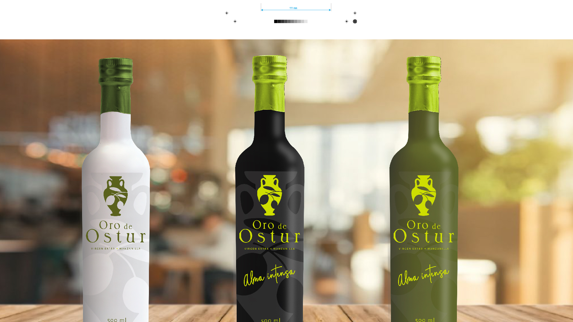
Our design for ORO DE OSTUR is a tribute to elegant simplicity. The label, with its palette of clean, contemporary colors, reflects the purity and high quality of the oil. The white bottle, accentuated with shades of olive green, symbolizes nature and freshness, while the black variant offers a touch of sophistication and modernity, perfect for the most discerning consumers.
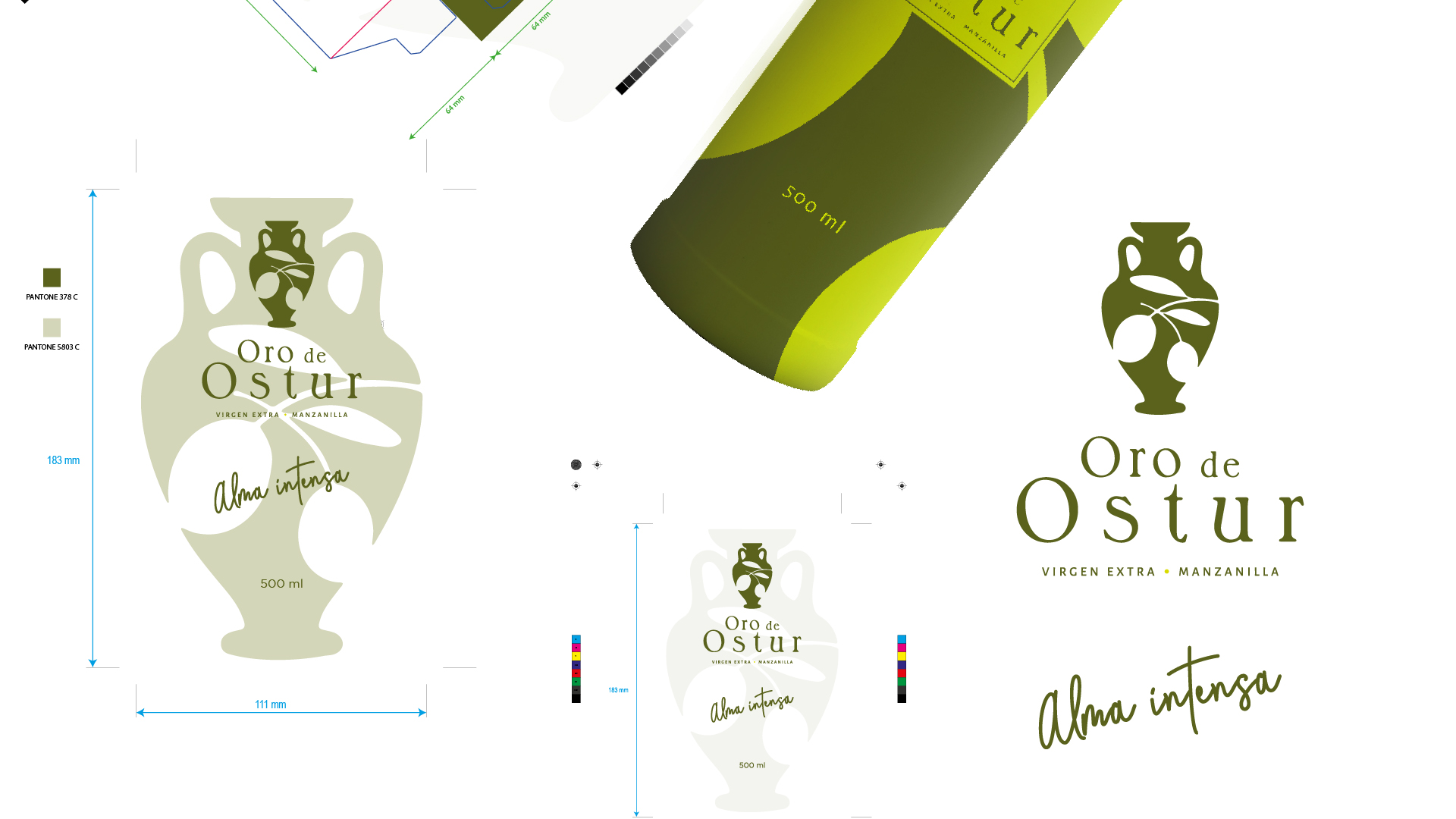
The typography chosen for "Alma Intensa" is fluid and organic, suggesting the naturalness and care with which each olive is grown and harvested. This typography, together with the stylized graphic of a classic amphora adorned with olive branches, connects us with the traditional roots of olive oil, but from a modern and refined perspective.
At OFIFACIL, we specialize in finding creative and personalized solutions for each client. Our experience of over 20 years in graphic design is reflected in every label, container, and packaging we create, focusing especially on the food sector, for oil mills and cooperatives.
We have professional illustrators dedicated to visually expressing the unique character of each product, ensuring that every design is not only aesthetically attractive but also tells a story and stands out in the market.
"ORO DE OSTUR" is not just an oil, it is a work of art that deserves to be presented in a container worthy of its legacy. With OFIFACIL, every drop of oil is cherished from the field to the table, encased in a design that captivates and seduces. Discover how our studio can elevate your product and place it at the very top of the graphic design Olympus. We are ready to face the challenge of making your brand shine.
For more information about our services and how we can help you stand out in a competitive market, visit our website or contact us directly. Your vision, our design: together, we will make history.
The visual identity creation for "Oro de Ostur" began with a deep dive into the very essence of extra virgin olive oil. Each aspect of the design is imbued with the story and quality that this oil represents. To encapsulate the nobility and purity of this golden liquid, the inspiration was to find something that resonated with both tradition and innovation.
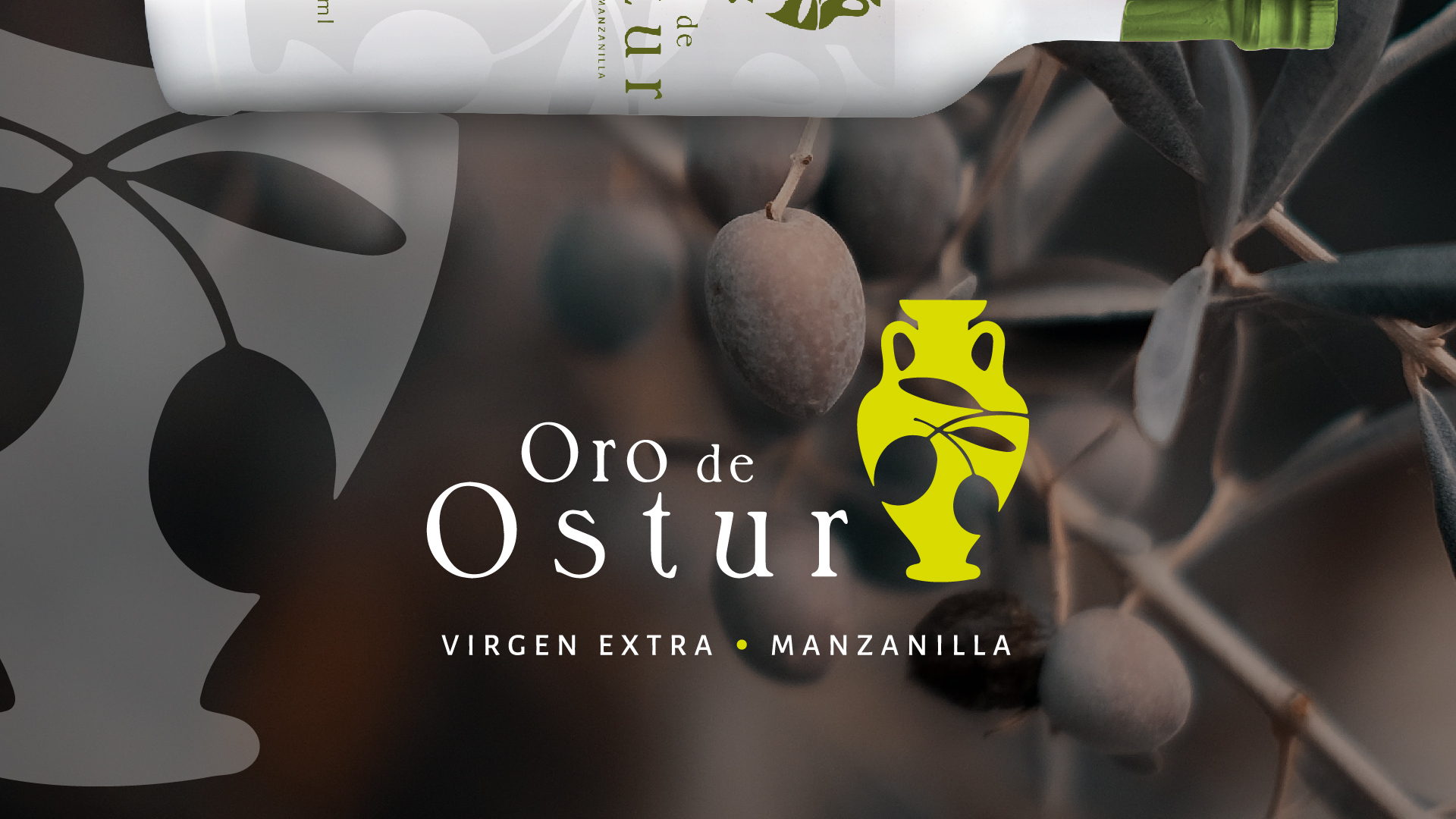
The graphic idea emerged from the simplicity of nature: an olive tree and its intertwining branches. This motif reflects the organic connection to the land and the culture of the olive. We chose a color palette that evokes both the earth and the fruit: olive greens represent the leaves and vitality of the tree, while earth tones symbolize the rich and fertile Spanish land.
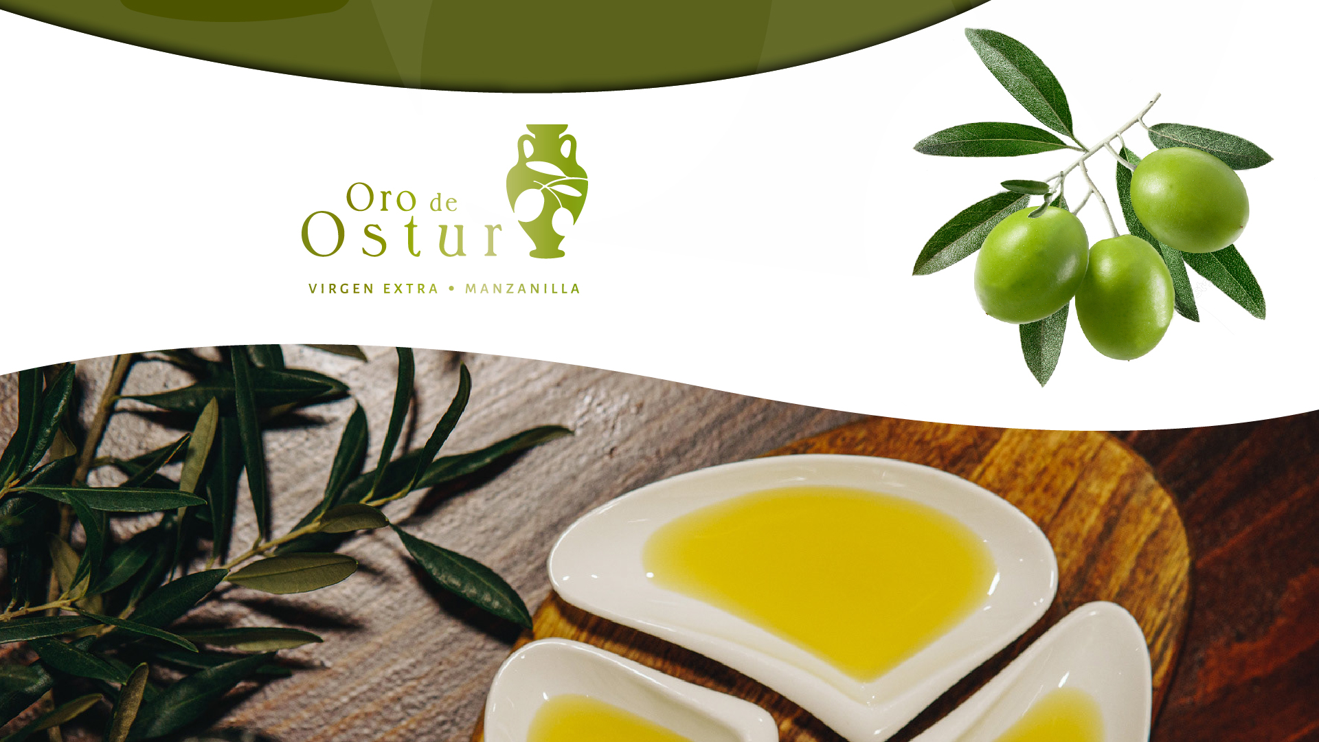
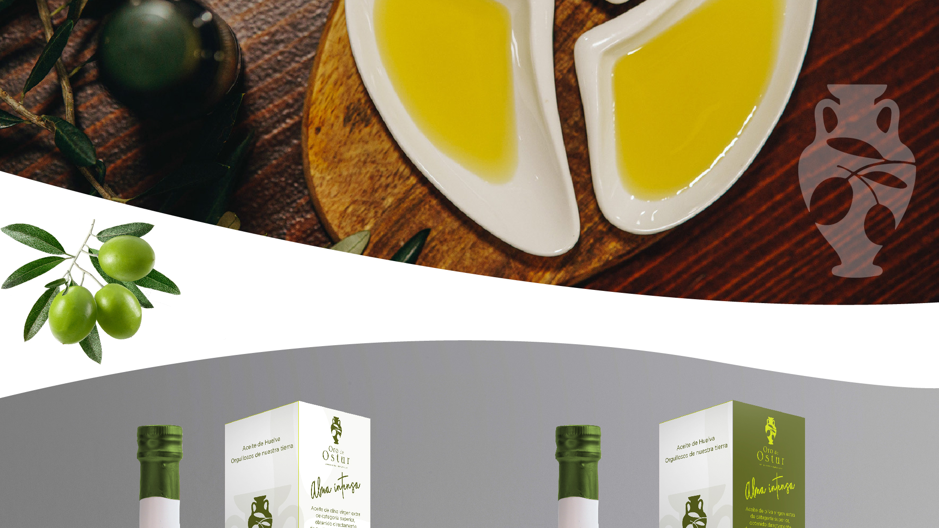
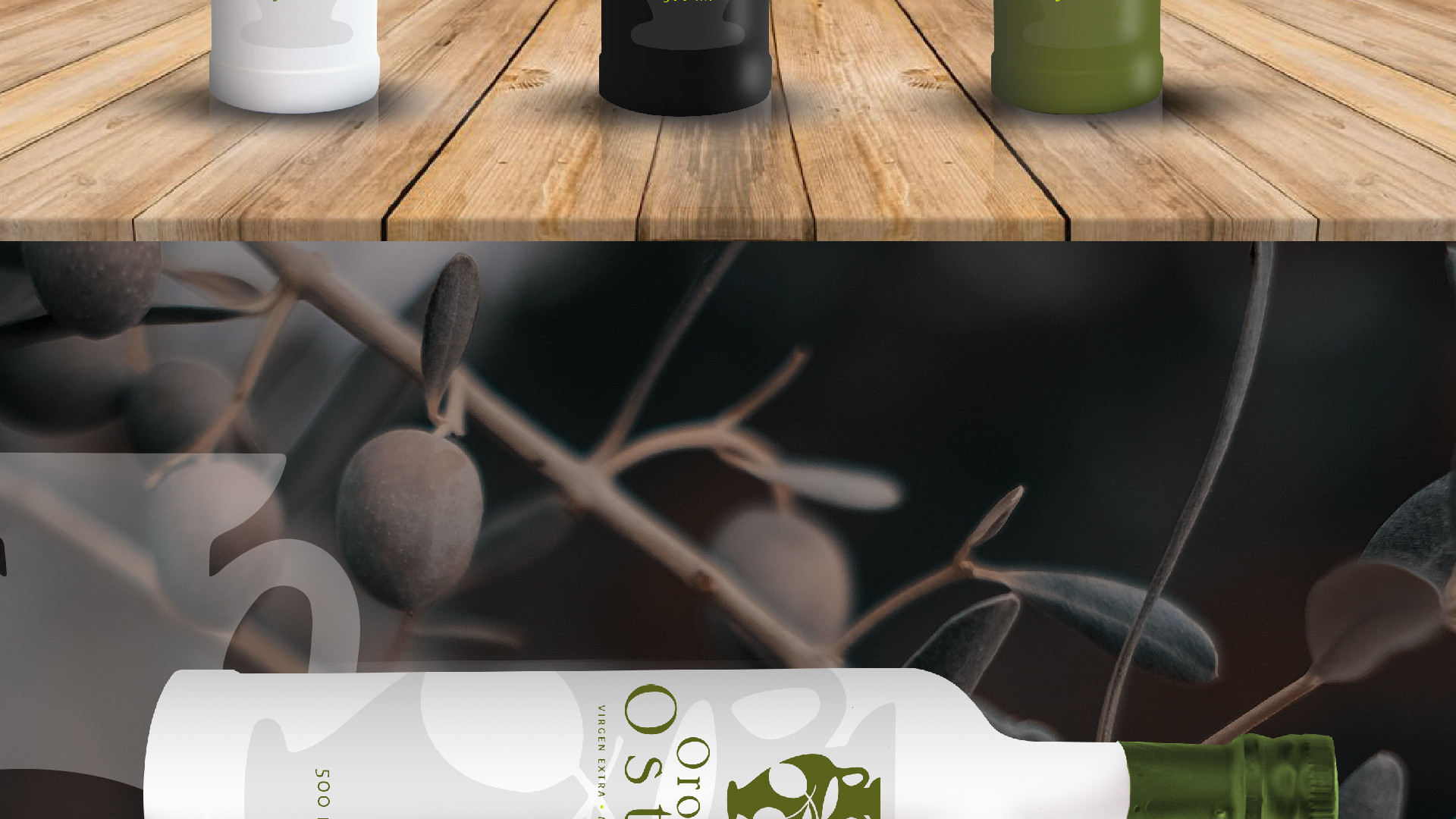
For the bottle, we opted for a minimalist design, focusing on the pure and ergonomic shape that guarantees both functionality and aesthetics. The immaculate white of the glass becomes a canvas for the logo, highlighting the stylized silhouette of a traditional amphora, a classic symbol of fine oil storage. This icon merges with a modern design that captures the gaze and promises a unique taste experience.
The "Oro de Ostur" logo was designed to evoke a sense of legacy and excellence. The classic typography is complemented by the modernity of clean lines, creating a perfect balance that speaks of heritage and avant-garde. The central graphic, an amphora with olives, visually connects the product to its origin, offering an instant message of quality and tradition.
The final result is a design that stands out on the shelves for its clarity and elegance and tells the story of extra virgin olive oil, from the vast olive fields to the consumer's table. With each bottle of "Oro de Ostur," we deliver not just a product but a promise of quality, tradition, and exceptional design, reflecting the passion and commitment to excellence that defines OFIFACIL.
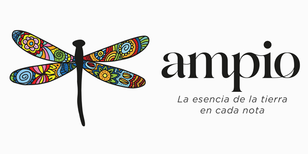
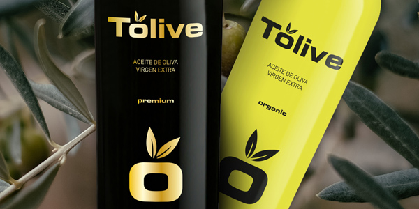
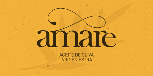
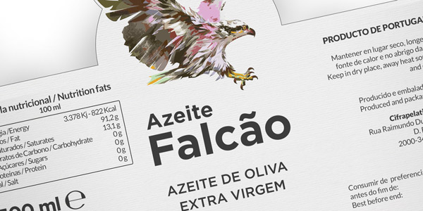
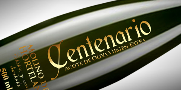
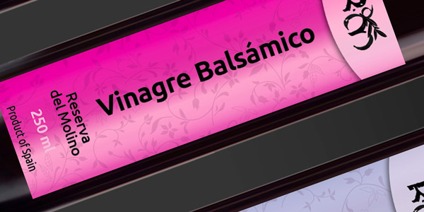
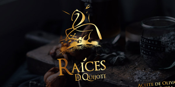
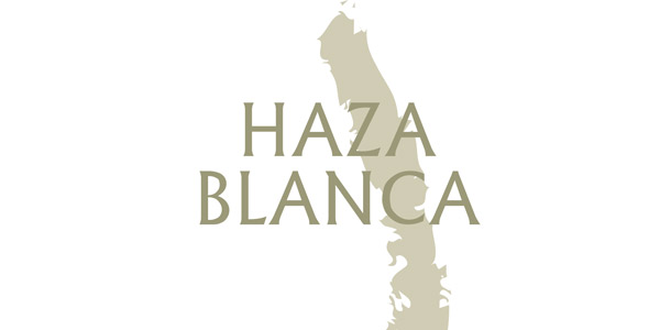
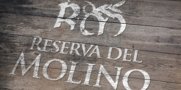
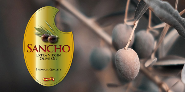
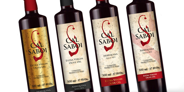
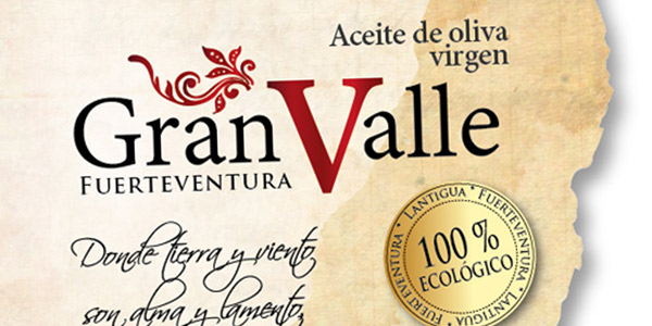
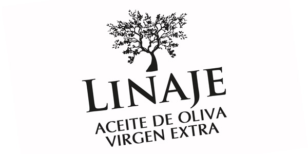
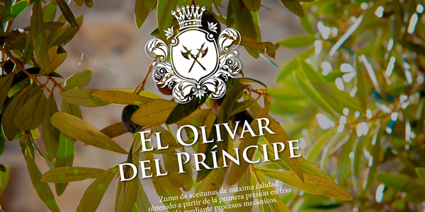
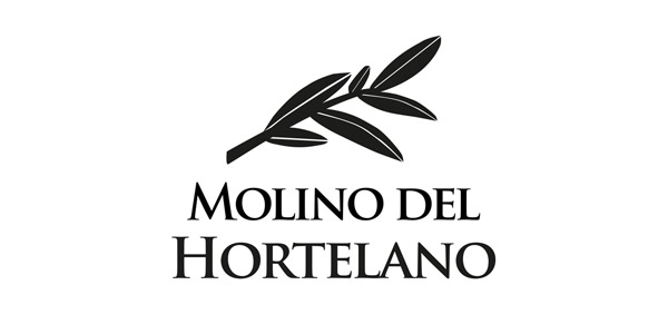
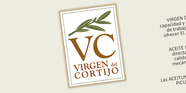
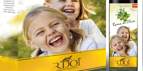
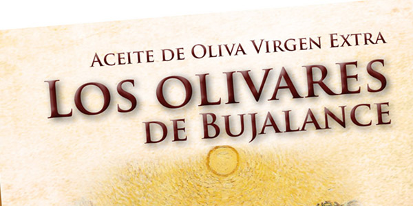
See latest design work on oil labels and oil packaging:
Select the work you want to see in the following images.
We use cookies. Continue browsing implies the acceptance of our: Cookies policy